
Challenge Seattle – Logo Refresh
UPDATED: 5/3/23, 10:30 a.m. PT
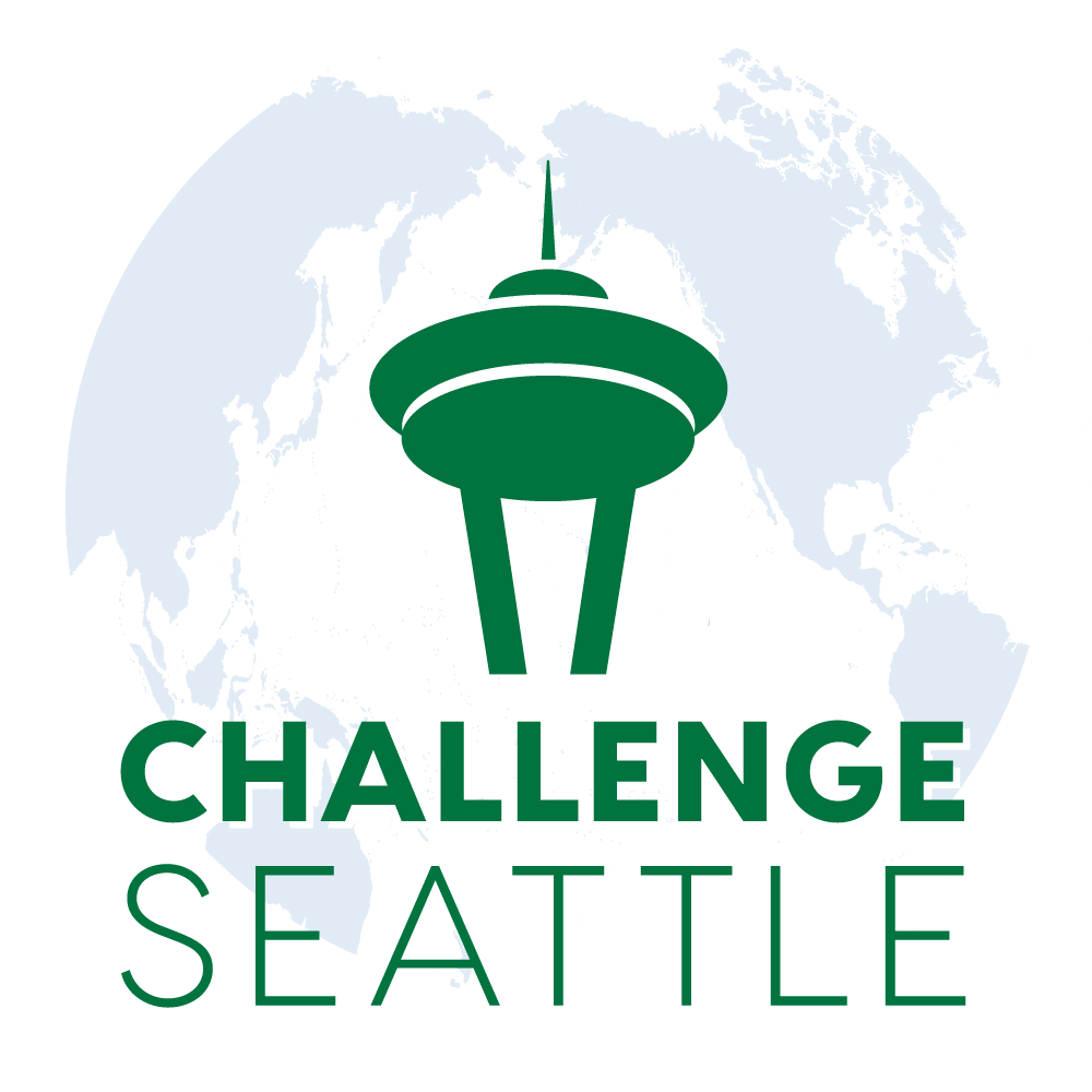
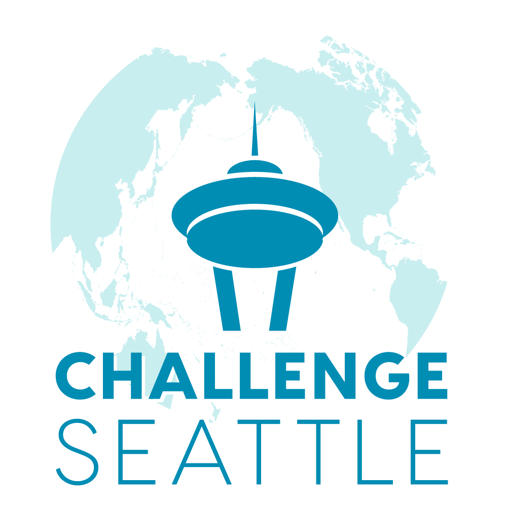
Approved
3A.

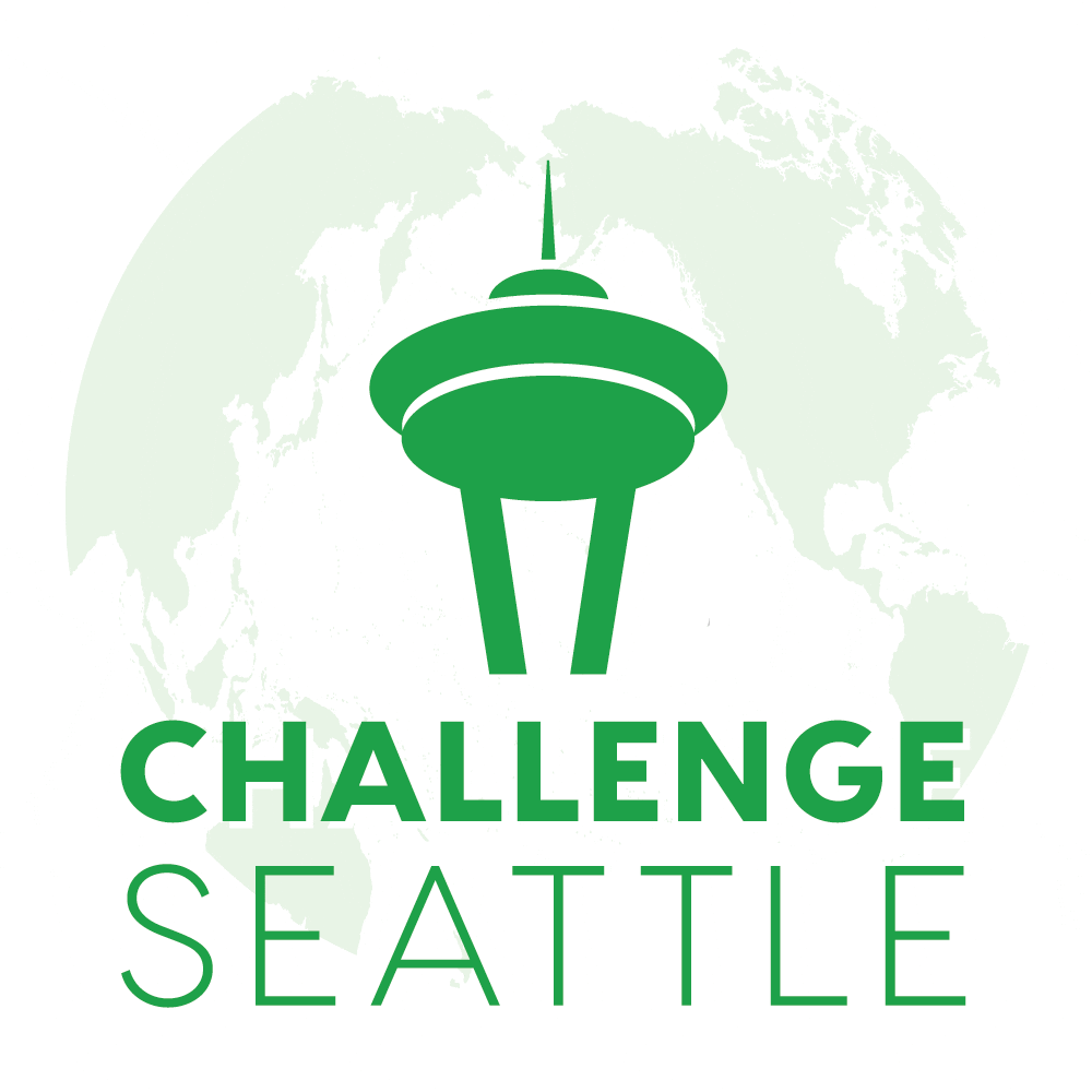
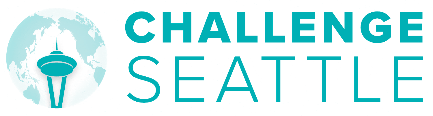
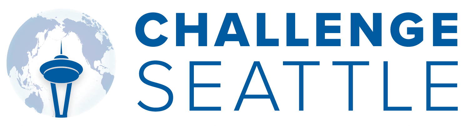
Blue-3A
Round 3
Preference indicated for 3A.
Request for options where colors are reversed (blue Needle/type and green map)
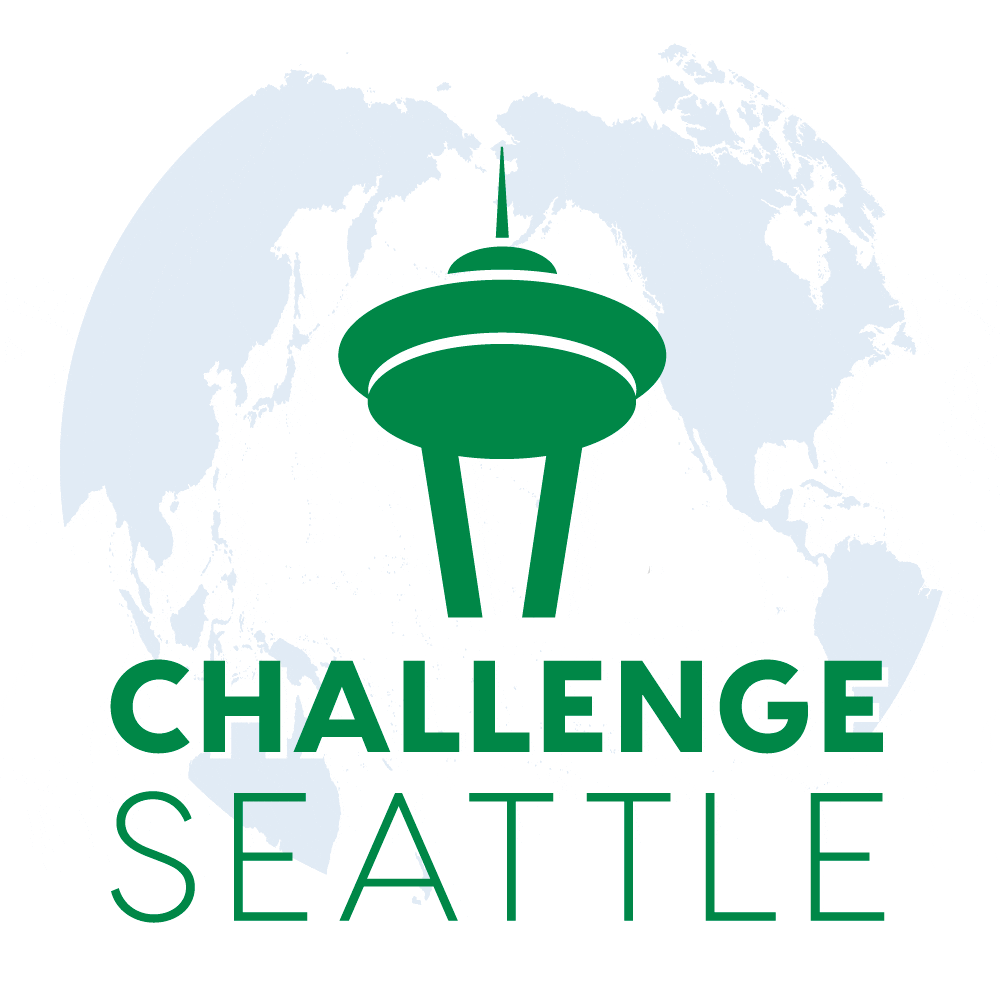
Blue-3A
Blue-Green-3E1
Blue-Green-3E2
Blue-Green-3E3
Round 2
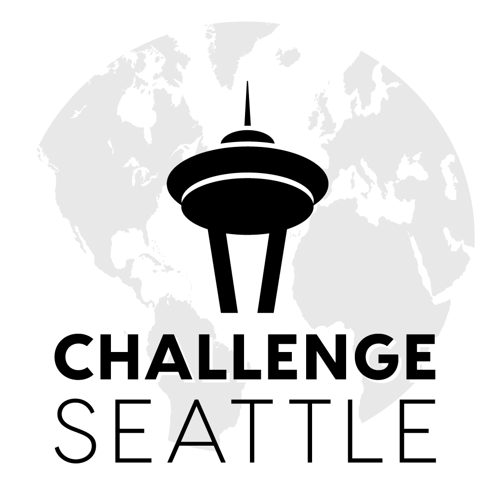
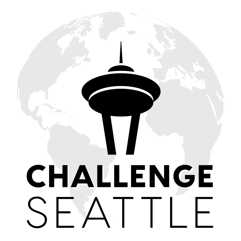
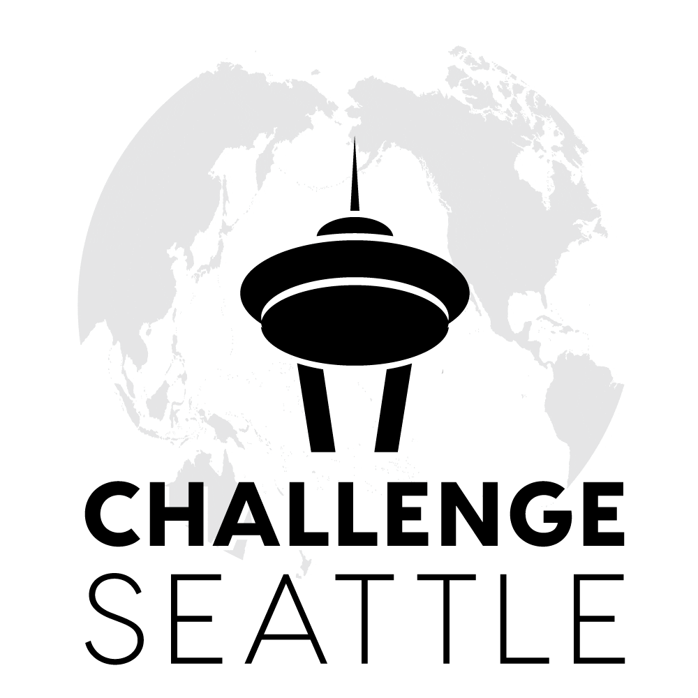
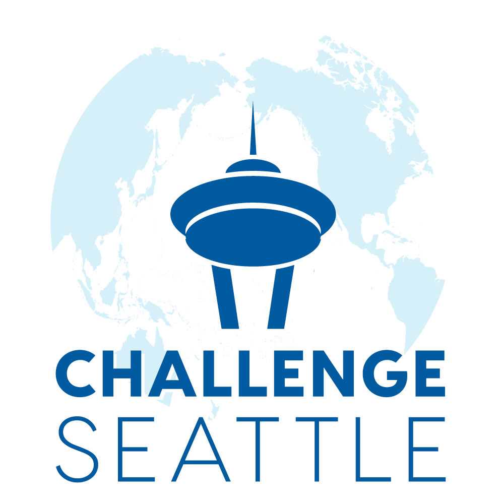
The square logo with the globe behind the Space Needle icon and type below — in blue (1K)— was preferred from Round 1.
Below, please find revised ideas that address additional feedback:
- Try a more “Seattle green”: Below are a few variations, as well as some blue/green combinations.
- Move the Needle and type upwards in relation to the globe: I also lengthened the Needle ‘legs’ and eliminated the gap between the legs and the saucer shapes of the Needle in order to clean up the perspective.
- Try a globe view that has the Western hemisphere on the left (Atlantic Ocean in the center): I don’t think this one works as well, mainly because of the lack of land mass to define the globe shape and the narrower Atlantic Ocean that makes the land masses tighter together (whereas the Pacific Ocean view leaves more space to clarify the Needle and type). There are two versions in black only — let me know if you want to see either of these in blue and/or green.
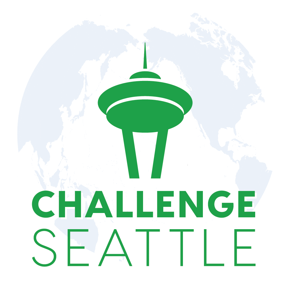
Blue-3A
Green-3A

Green-3B

Green-3C
Green-Blue-3D
Green-Blue-3E
Green-Blue-3F
Atlantic-Black-A
Atlantic-Black-B
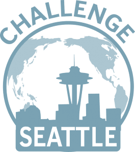
Current logo:
Round 1: Initial ideas
You requested a modification of your current logo rather than a brand-new logo. We worked with the existing logo for the first two ideas. In addition, we present two ideas for how we might approach a new logo, in case they spark any interest or ideas.
We see a number of ways in which your existing logo could be improved (these include your requests):
- Try richer, deeper colors that coordinate with your affiliated organizations (your request). The initial ideas below use a few blue and green variations, along with a simple black version (as all logos should work in black first!). We can try additional variations in the next round.
- Try horizontal and/or non-vertical orientations (your request). Square is the most versatile space for logo applications, so we tried both horizontal and square-space ideas.
- Try new typography. We tried two new typefaces — Visby and Proxima Nova — which are similar in look and elegantly balance between heavier and lighter fonts.
- Bring the two words of the organization title — “Challenge Seattle” — together. It is a powerful phrase, with both an imperative quality (“Show us, Seattle!”) and a narrative quality (“This is the challenge before us”). They work best as a phrase and so we put them together visually.
- Simplify and clean up the elements. Logos work best as symbols and simple ideas and worst as detailed illustrations.
- Simplify the skyline idea. For most viewers, we’re assuming the only distinguishable building in the skyline of the present logo is the Space Needle — the most iconic of Seattle icons. We can clean up those elements and simplify and strengthen the logo by stripping the skyline down to the Space Needle. Of course, we understand that using the Space Needle is not original. However, you are a local and regional force backed by many of the region’s leading organizations. It’s really about the iconic spirit behind your mission — calling together a community, characterized by a unique and historic spirit of renewal, to rally for the future. What better symbol of this than the Space Needle?
- Make the Space Needle element more iconic. For a more interesting and original (and less clip-art) look, and to add depth, we shifted the perspective to that of viewing the space needle from below, and also simplified the overall interpretation, while keeping true to its iconic shape.
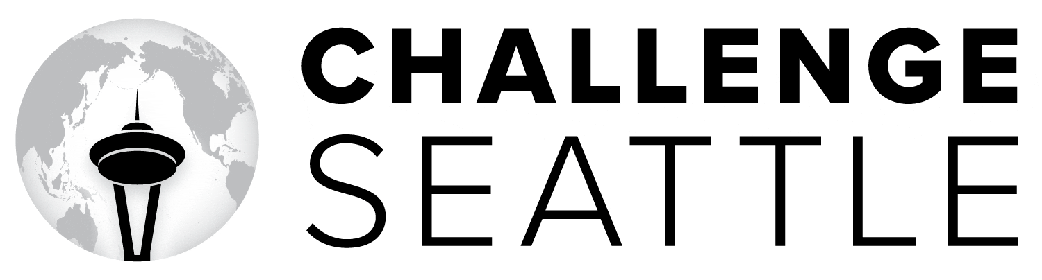
Horizontal orientations.
We have two ideas here — one using the existing globe element and one without — the latter, a simplified version with the new Space Needle icon.
Typeface: Proxima Nova
With the globe…
Click on an image for a larger view.
1-A
1-B
1-C

1-D
With only the Space Needle icon…
Click on an image for a larger view.
1-E
1-F
1-G
1-H
Square spaces.
The ideal, most versatile space for a logo is square. As above, we have two ideas here — one using the existing globe element and one without — the latter, a simplified version with the new Space Needle icon.
Typeface: Visby
With the globe…
Click on an image for a larger view.
1-I

1-J
1-K
1-L
With only the Space Needle icon…
Click on an image for a larger view.
1-M
1-N
1-O
1-P